For this vidual advocacy project, myself, Halee Merimon, and Ana Robles worked with local business owners and pillars to the black community, Maceo Davis. Our task was to conduct independent inquiry and research through critical engagement with diverse, multicultural, and multidisciplinary information sources, including an understanding of dominant artistic discourses and their relationship to underrepresented groups and ideas. Through speaking with the business owners, we determined what deliverables would be needed to bring new life to their businesses.
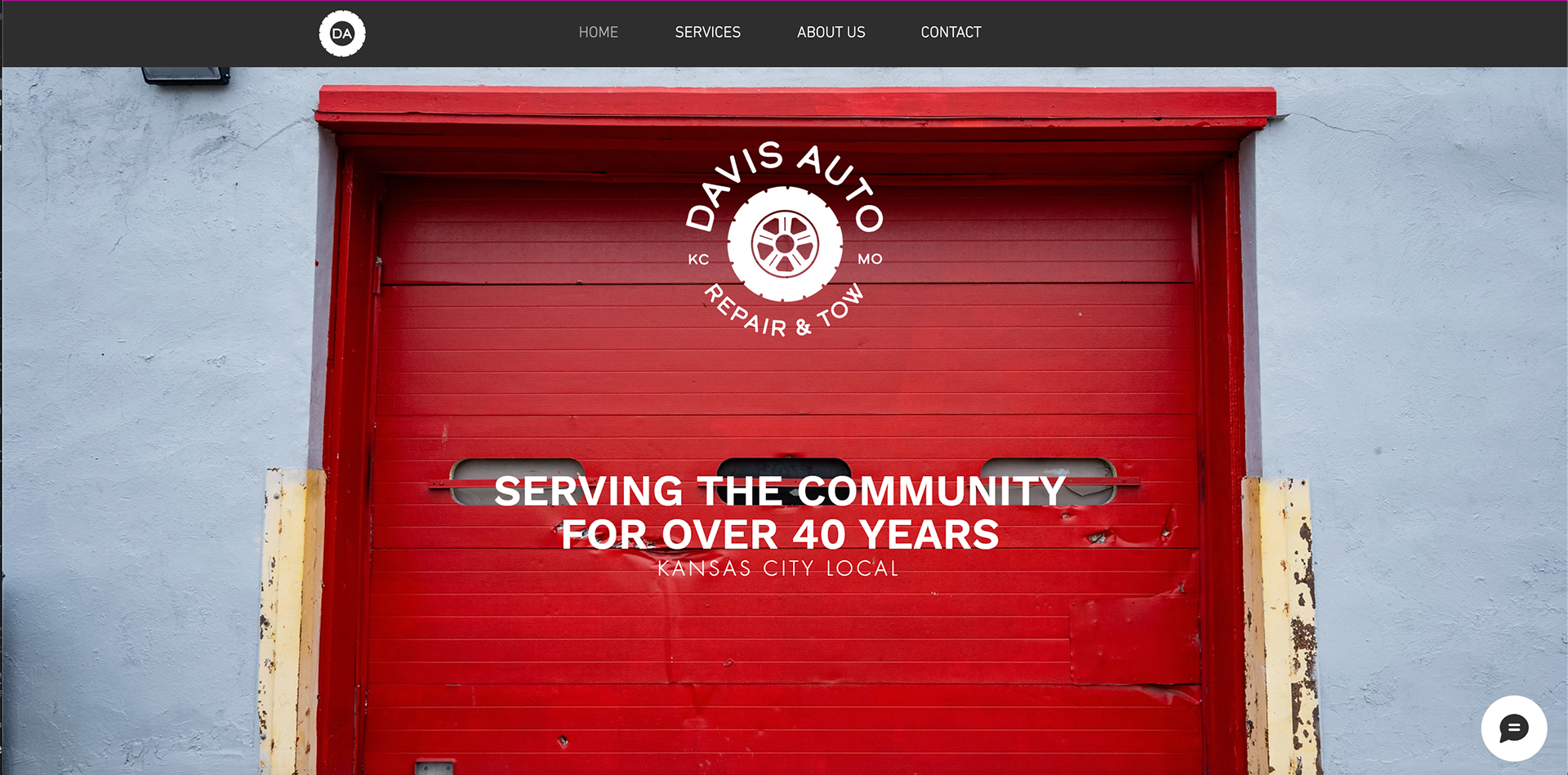
Davis Auto Repair & Tow is an auto repair company that has been passed down for generations. Maceo has maintained the business for a very long time, creating long-established relationships with his customers. Through tradition, the business is tailored to local customers and shops. Due to the outreach and assistance to local residents by the shop, Davis Auto Repair & Tow has been able to create a community that is extremely loyal to the company. The employees are honest about their work to their customers and they care about reputable work.
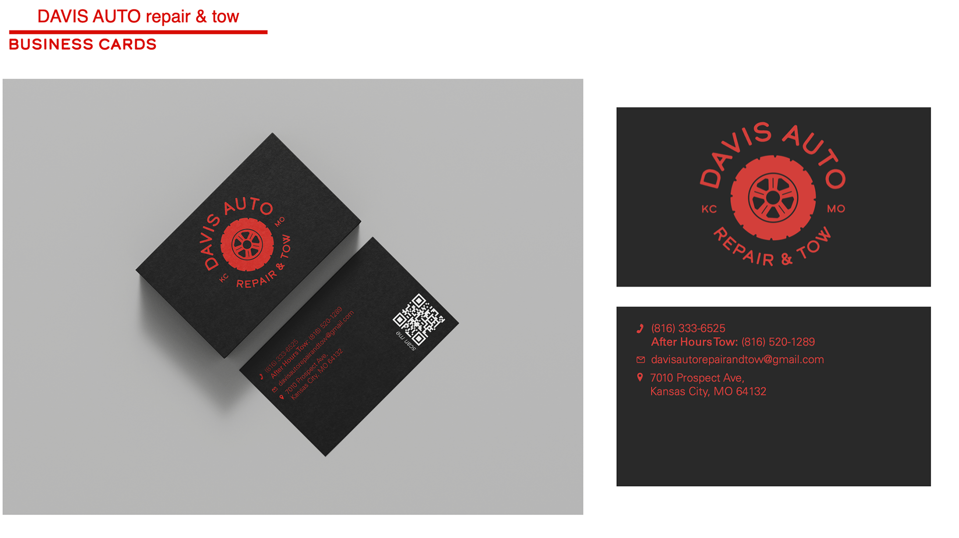
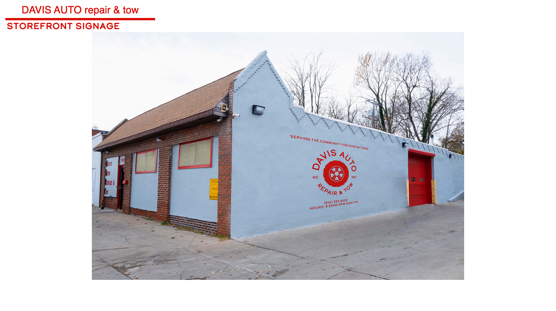
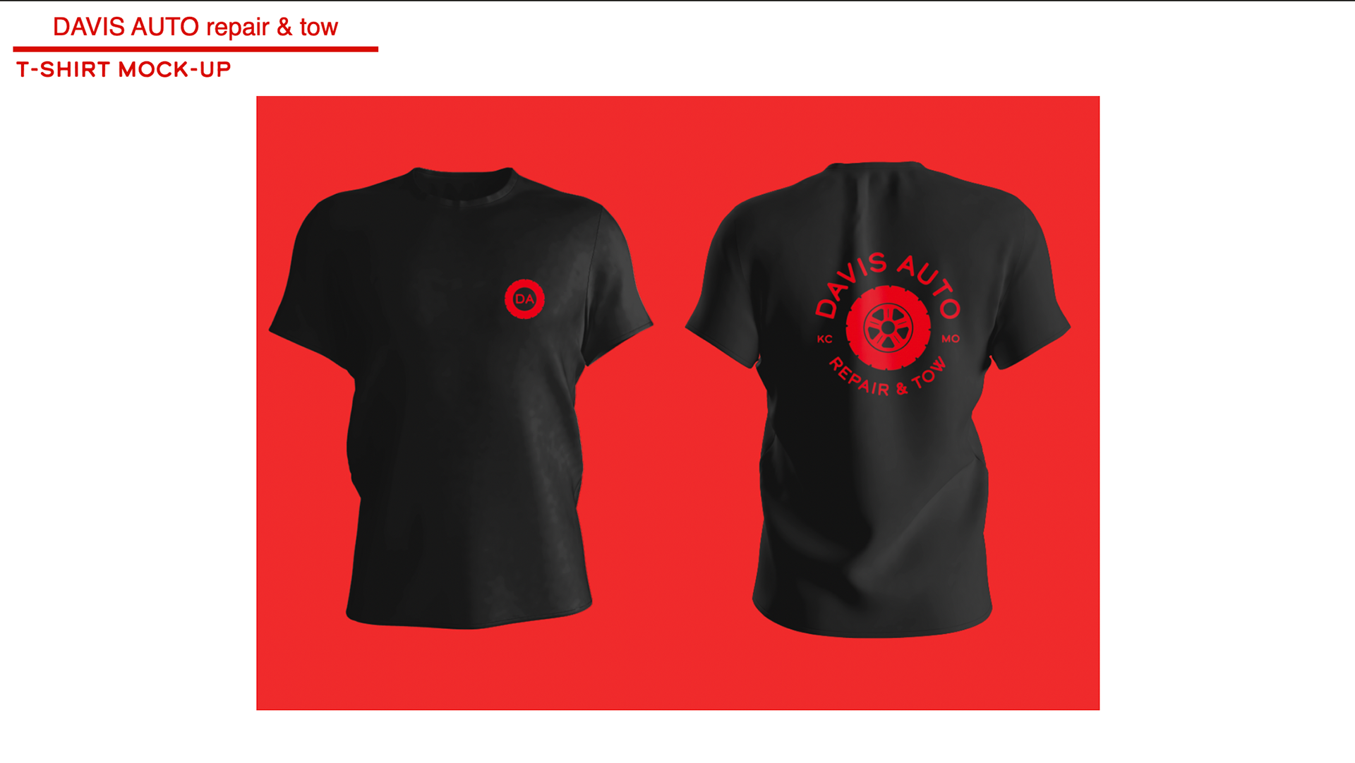
FINAL DELIVERABLES
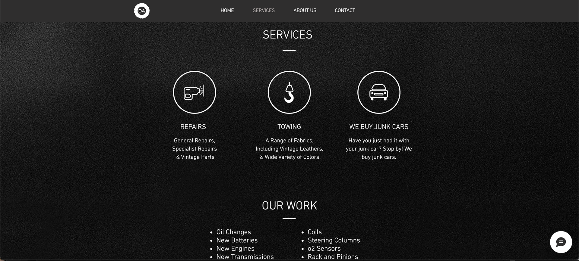
- LINK TO WIX SITE -
https://davisautorepair79.wixsite.com/my-site
PROCESS
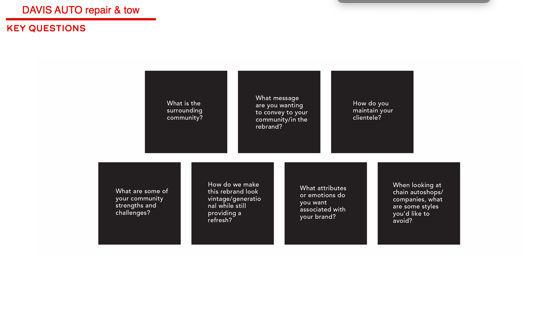
These are the main questions we asked ourselves and Mr. Maceo Davis when beginning our design research
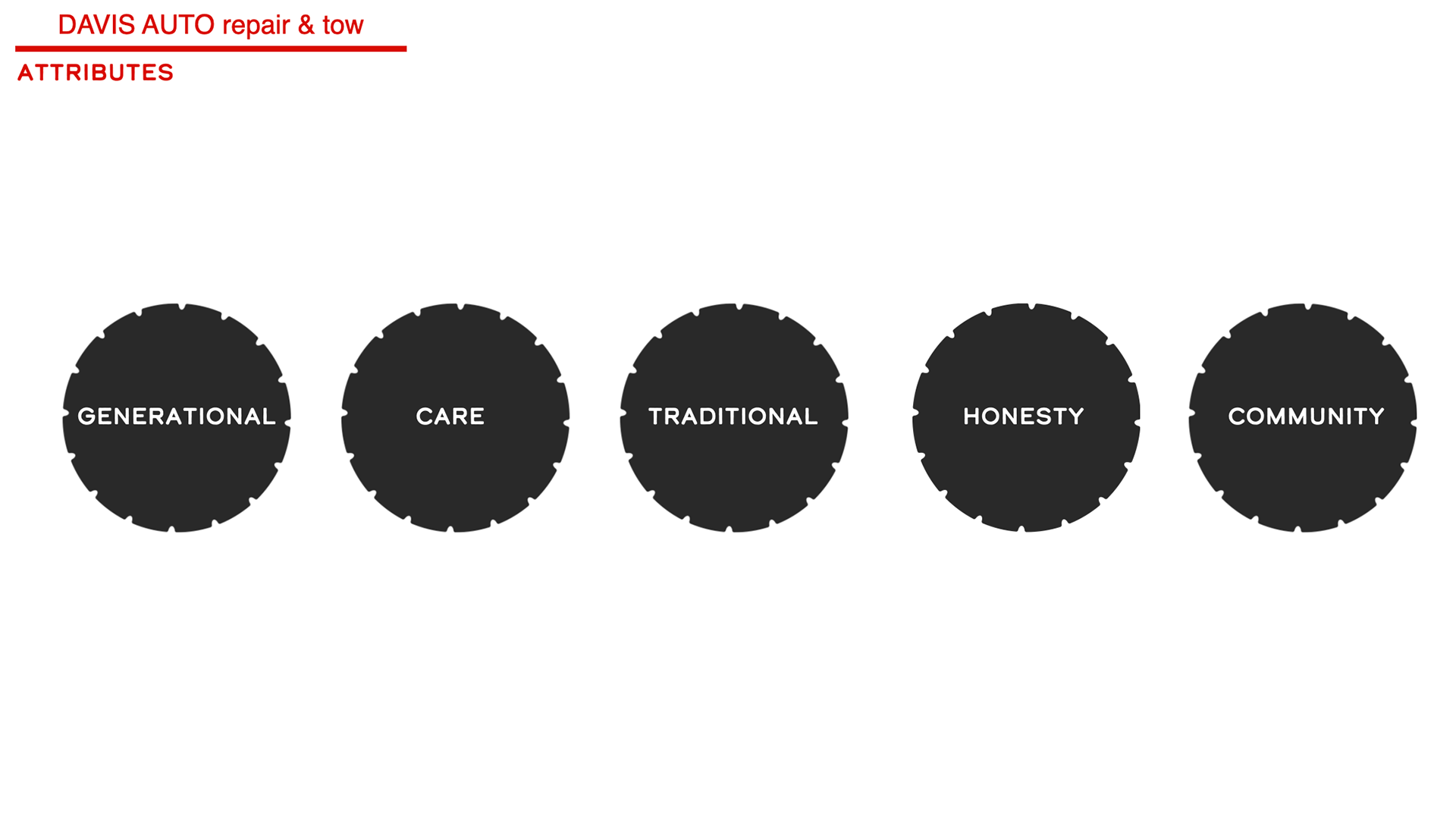
These are the design attributes we assigned to Maceo Davis' business by reading business reviews, visiting the business site, interacting with the local community, and talking to Maceo himself.
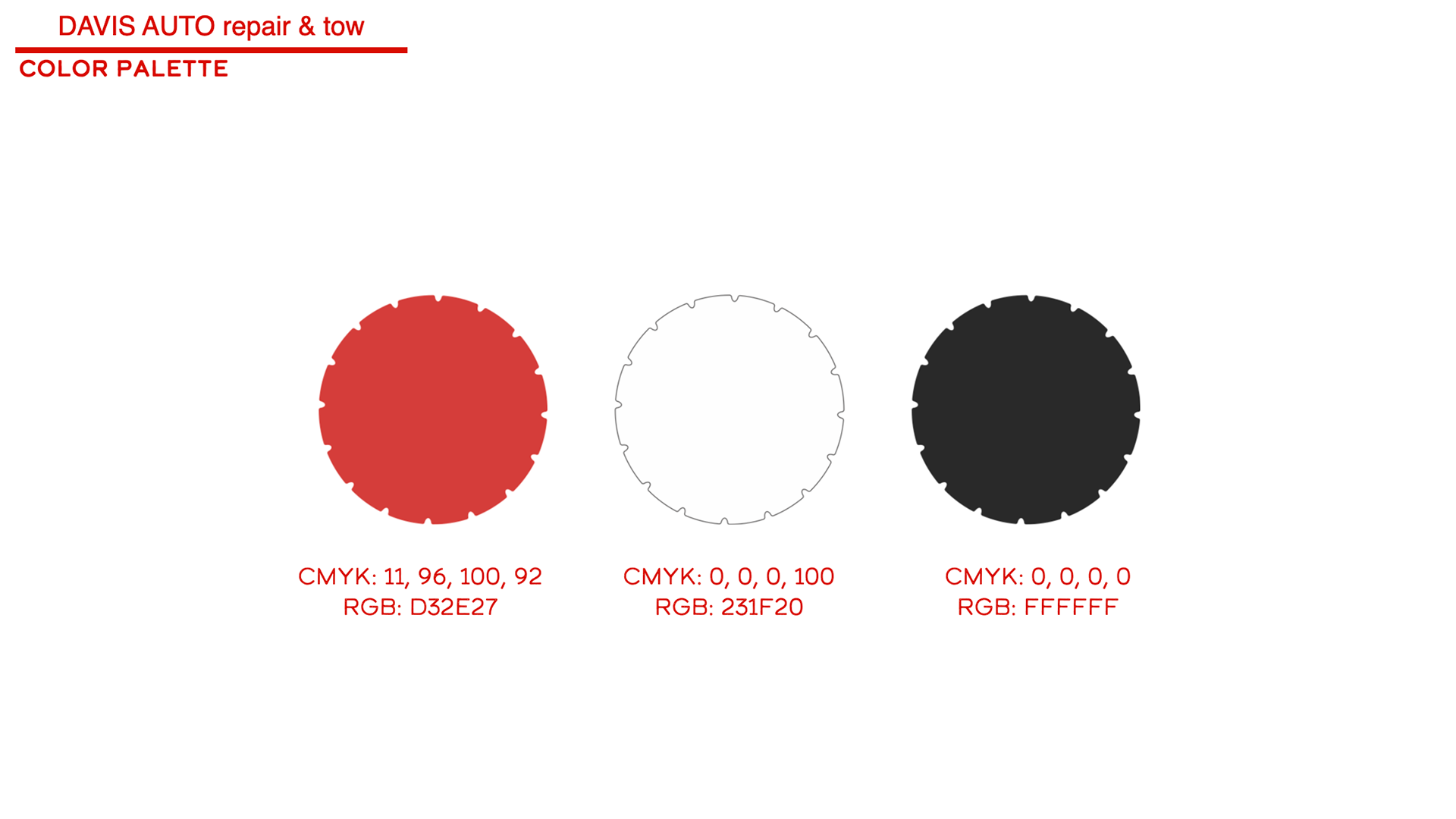
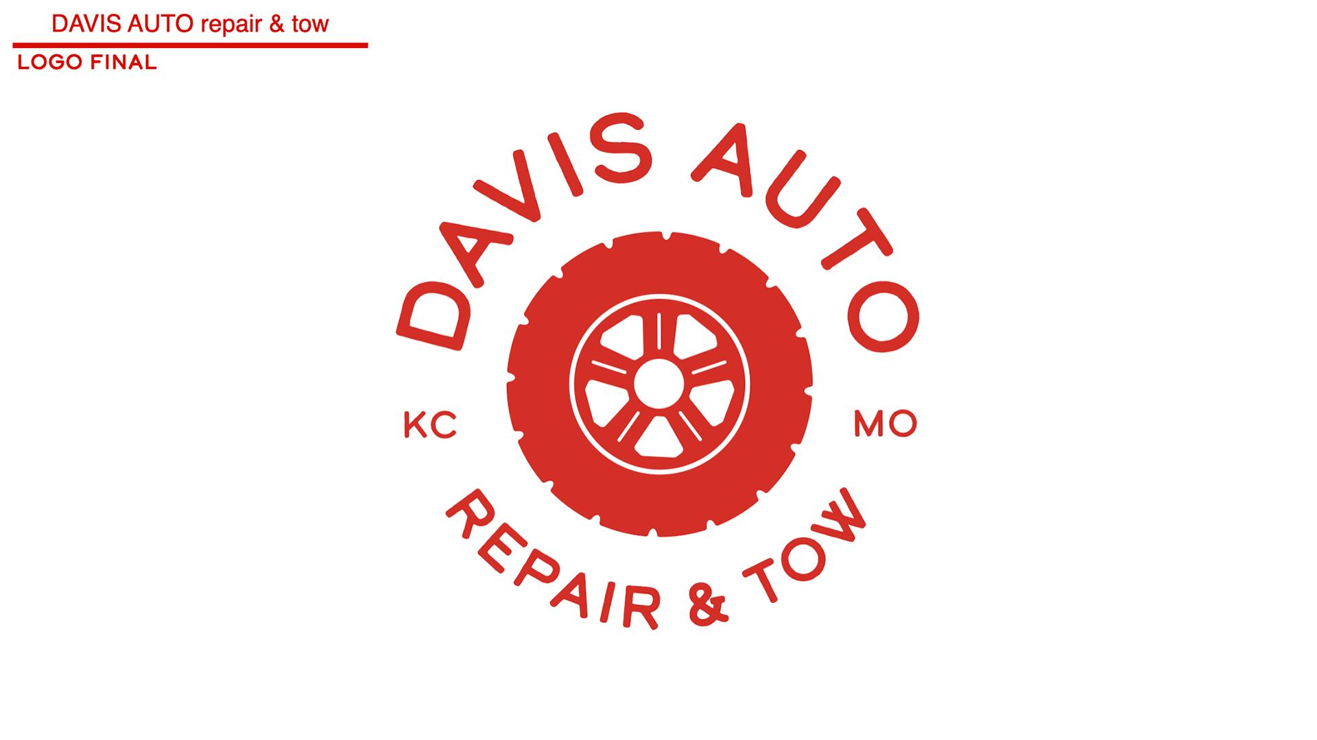
For color, it was clear that red had to continue to represent Davis auto. As a local kc business, the Chiefs are very important to Maceo and Davis auto. Because the red is so bold and because we wanted it to stand out the most, we simply paired it with black and white. This way chiefs red remains the star of Davis auto branding, it is memorable and easy to pair with both black and white for any future design.
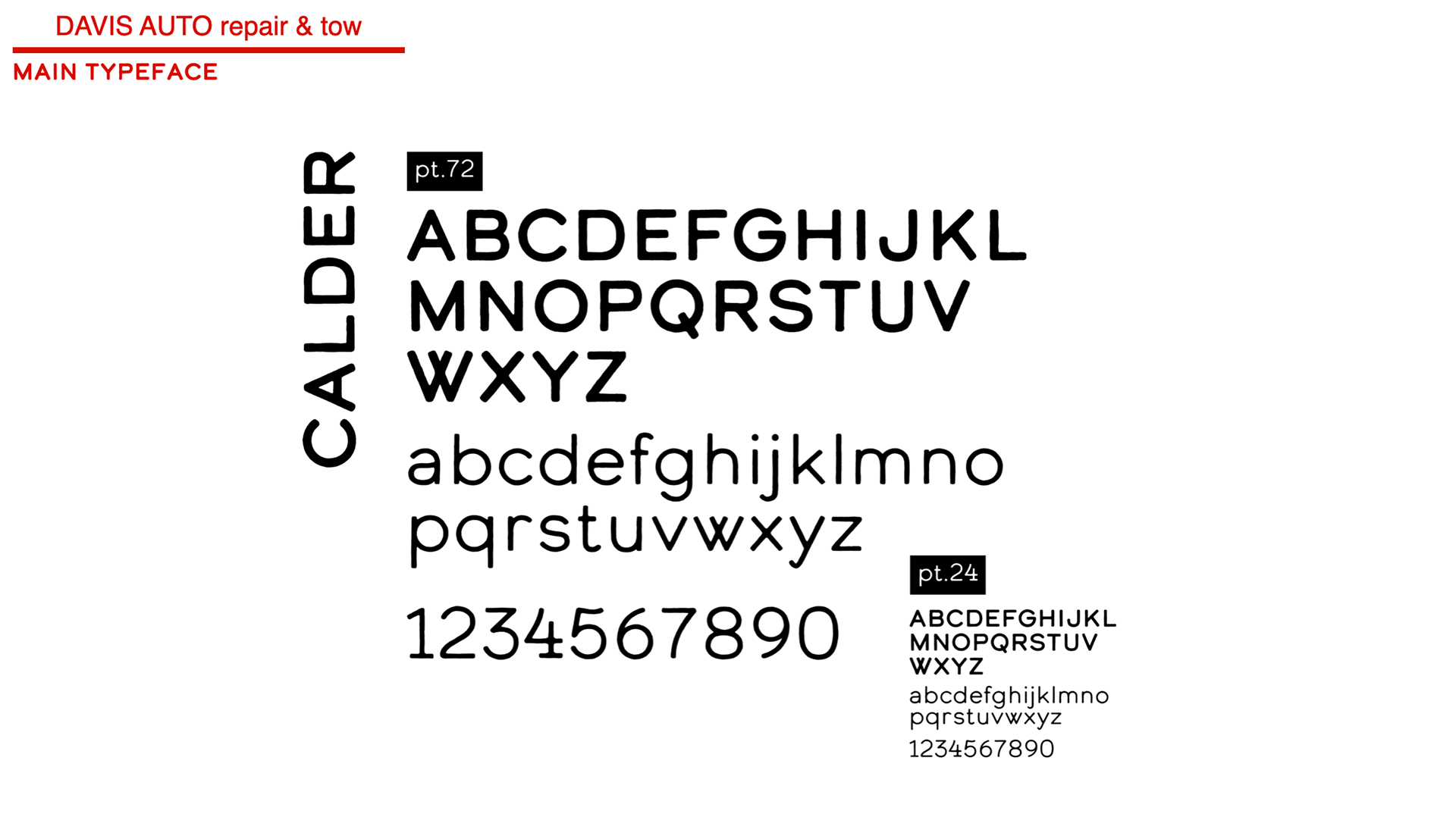
Calder was chosen as our main typeface that was the best fit not only because of its rugged edges but because of its traditional letter styling and legibility. This typeface went right along with our chosen attributes and aligned well with the designs that were created.

Through our attribute assignment, research, and site visits, we began to iterate different type, colors, and logo ideas for Davis auto. We began logo iteration by attempting to encompass all of the company attributes within each logo. We began with rapid making, and ideating, then getting together to edit each logo, each shape, and type that accompanied it.
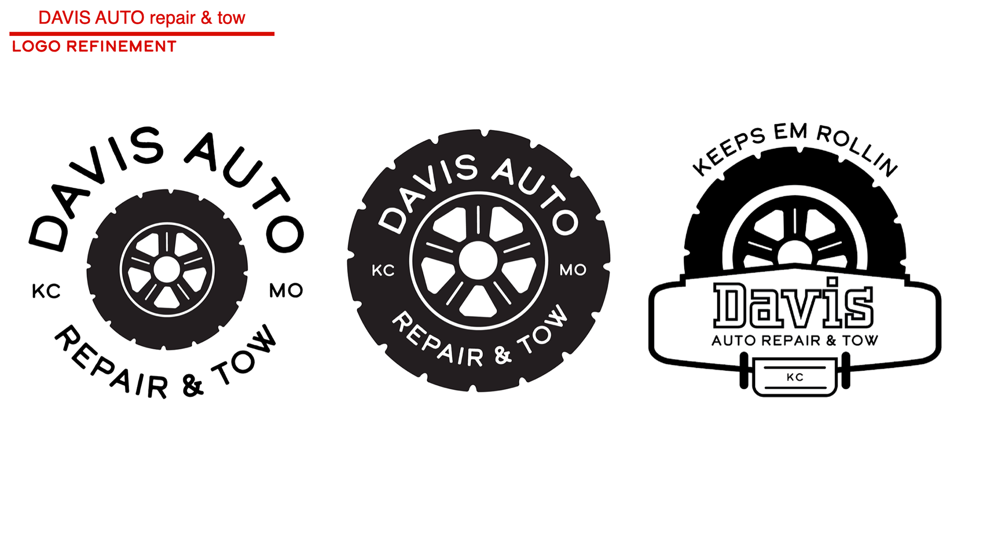
These three are the iterations we then began to make together following Maceo choosing the tire motif for the new logo. We then began experimenting with the tire and how business information and attributes could be conveyed through the chosen direction